


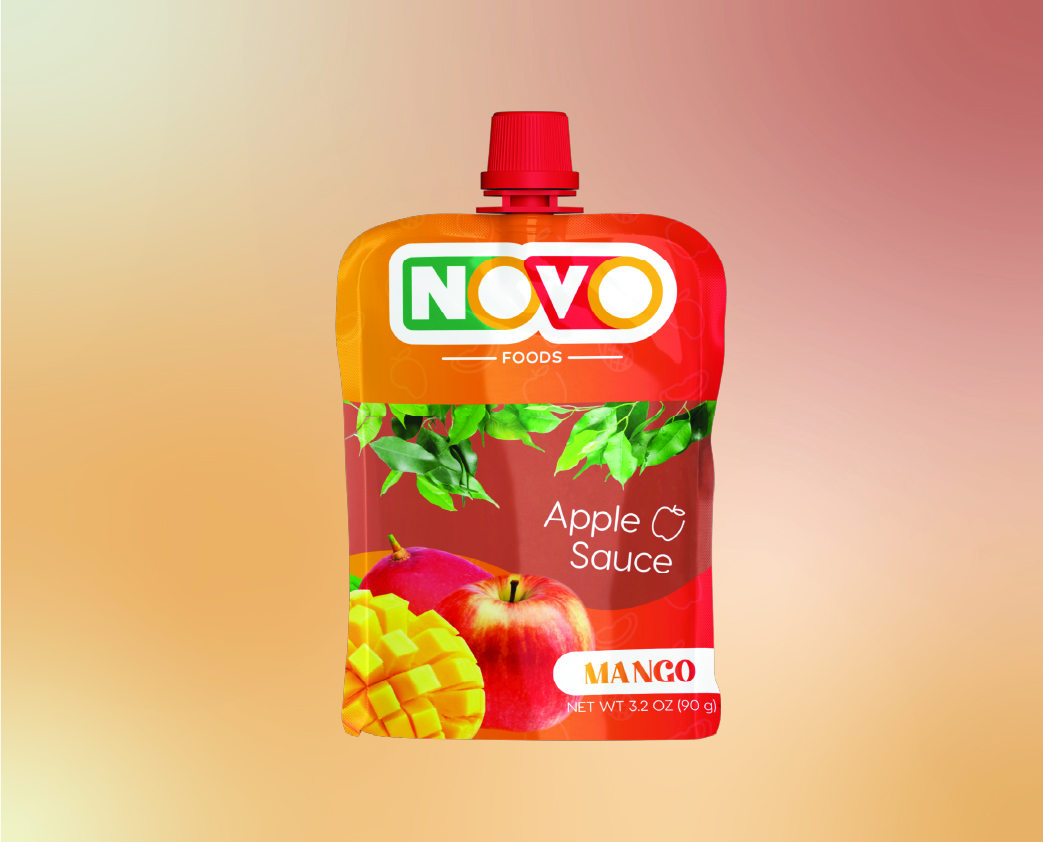
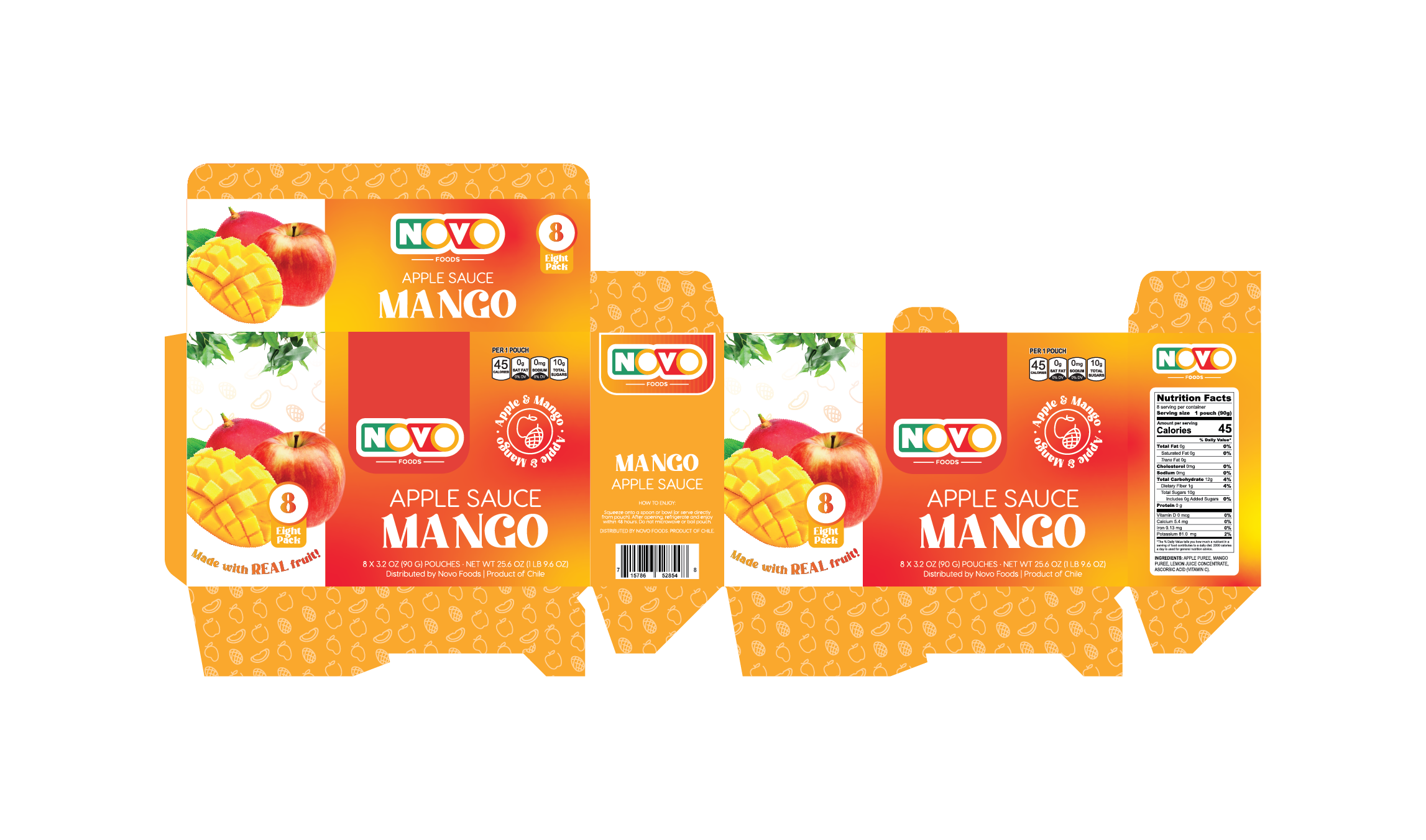
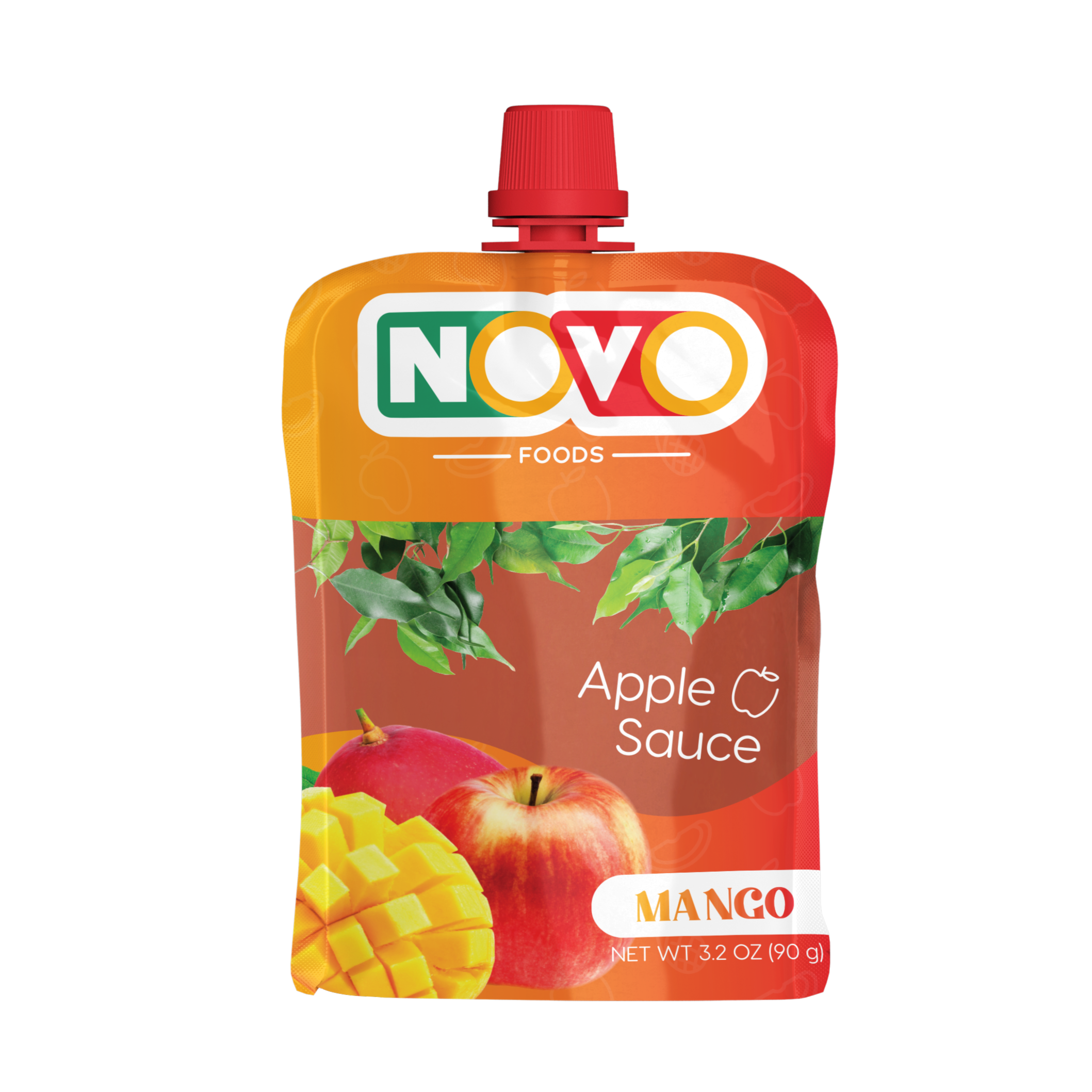
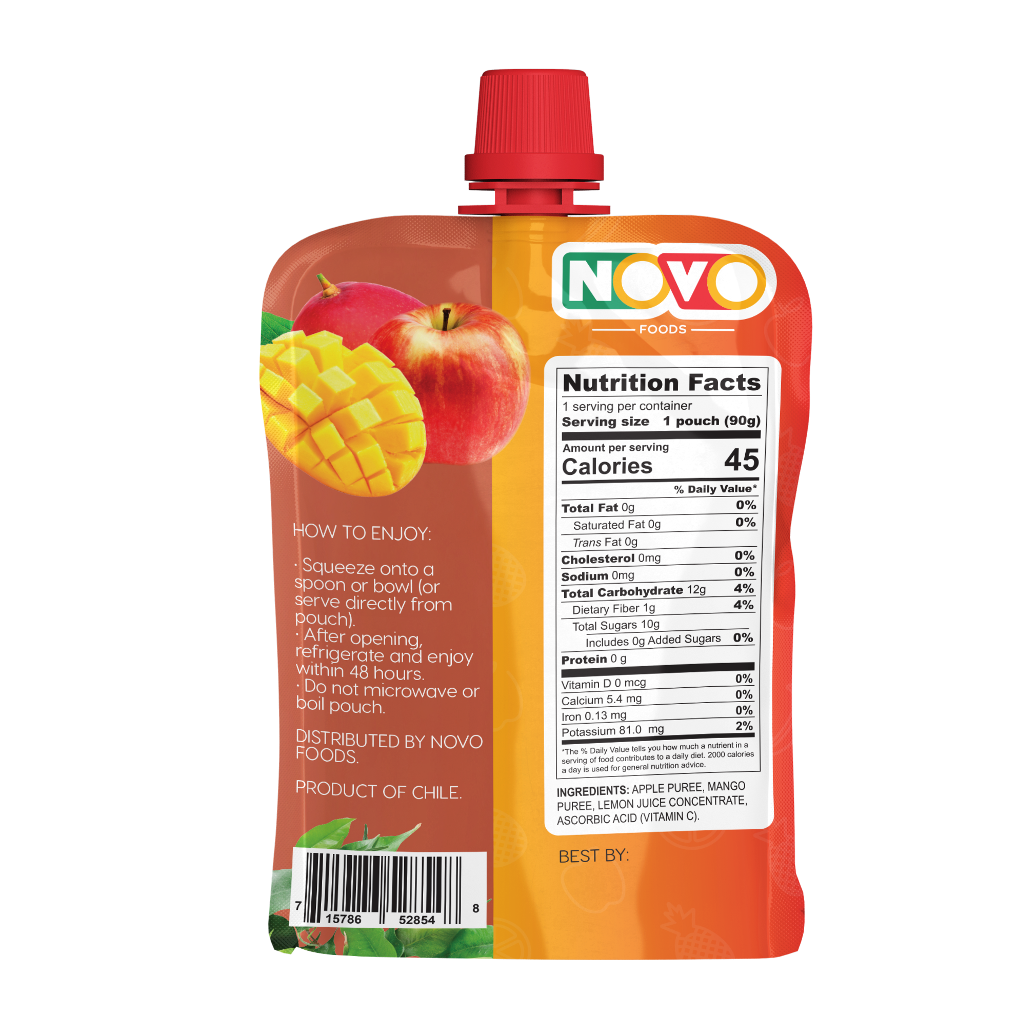
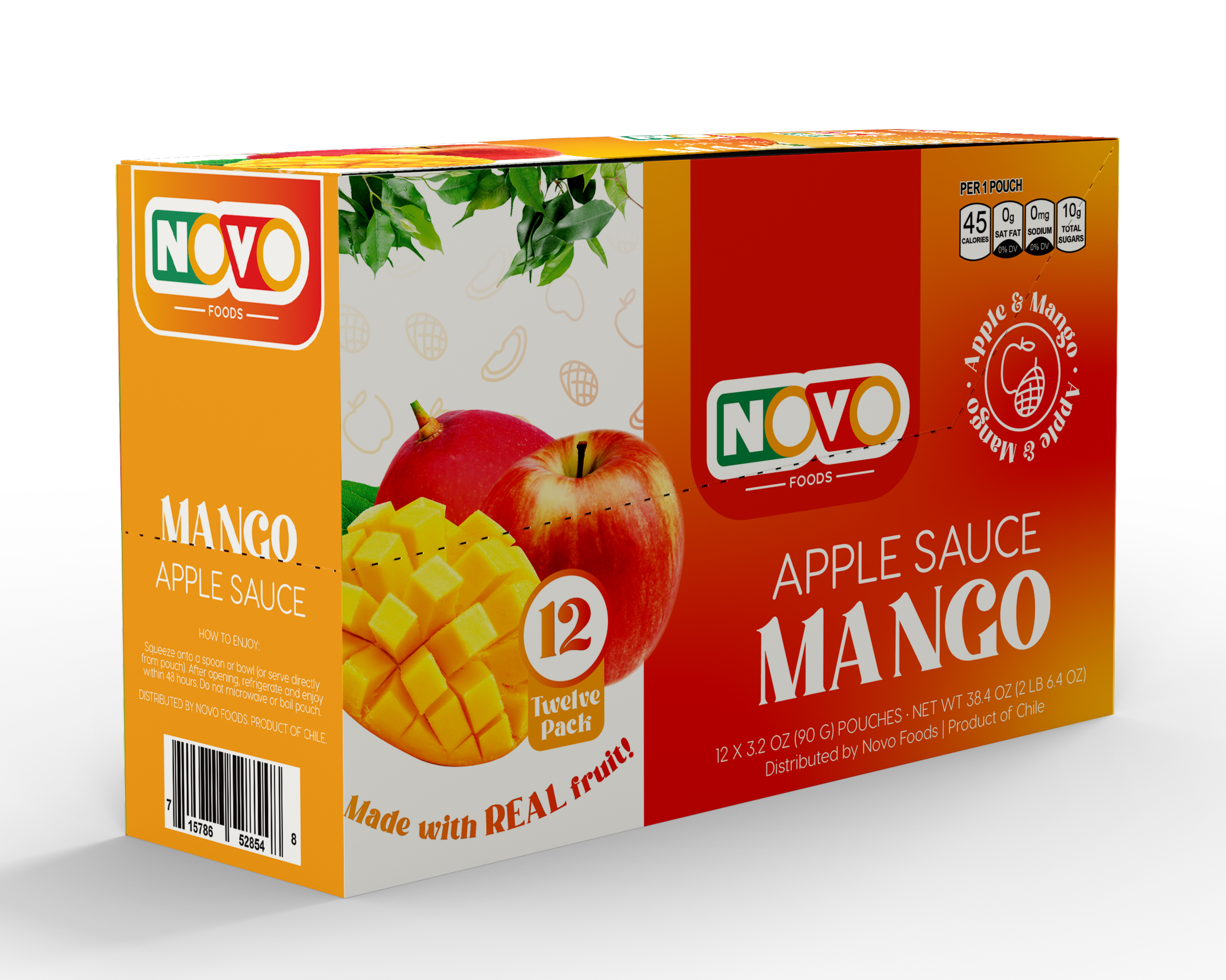
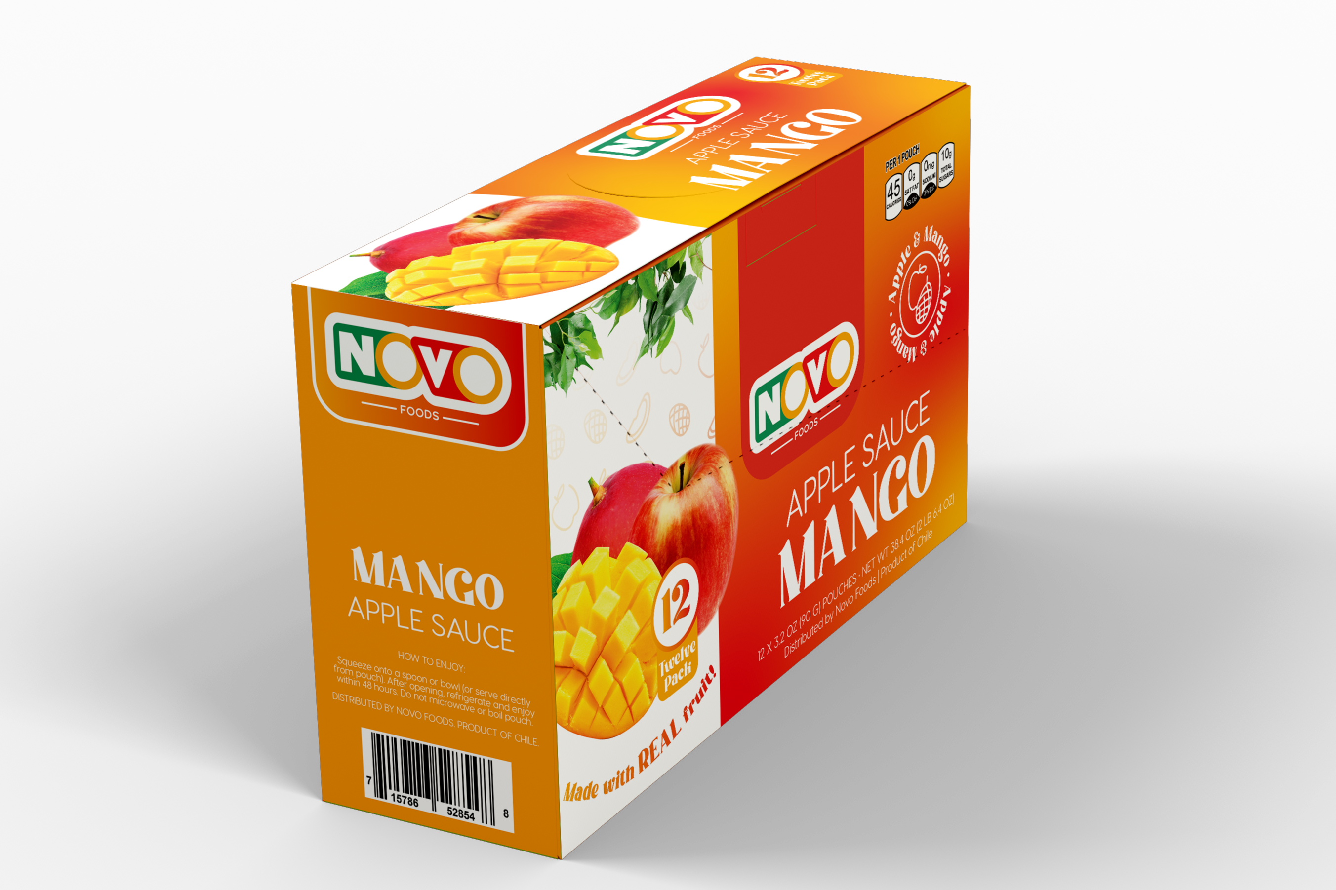
Mango squeeze pouch labeling.

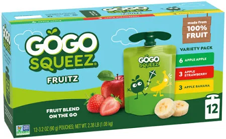
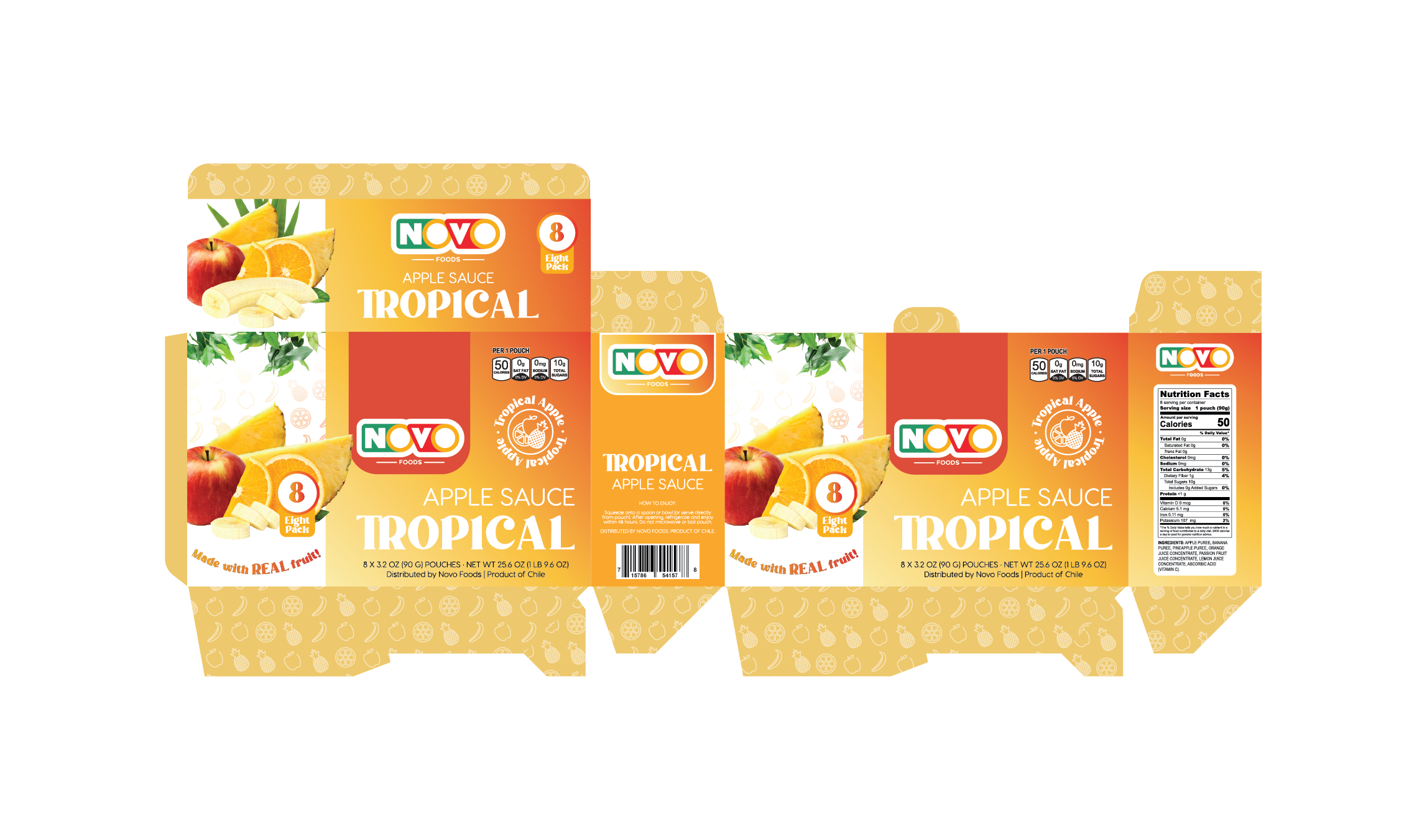
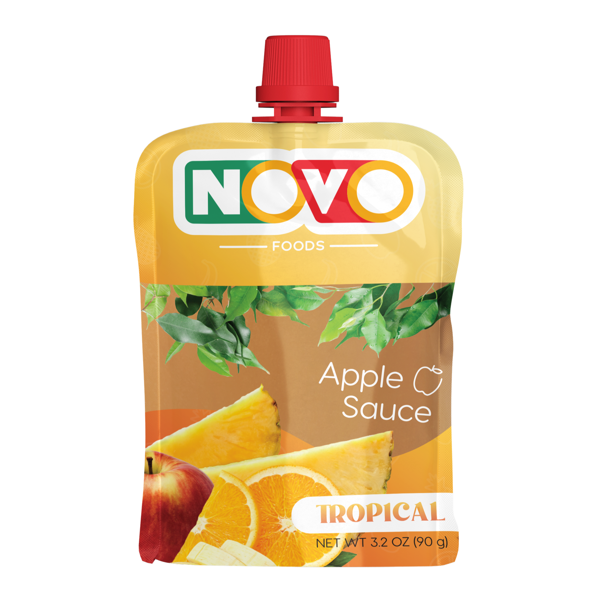
Flavor display boxes and pouch front.


Context
Client
NOVO Inc. is a global food brand with emerging lines in retail-distributed consumer packaged commodities.
Objective
This emerging product line from NOVO Foods emphasized simplicity, convenience, and parent-friendly appeal. My objective was to establish a clean, cohesive design system for the introductory fruit purée SKUs—one that could support future expansion, resonate with families, and stand out in a competitive retail landscape.
Brief
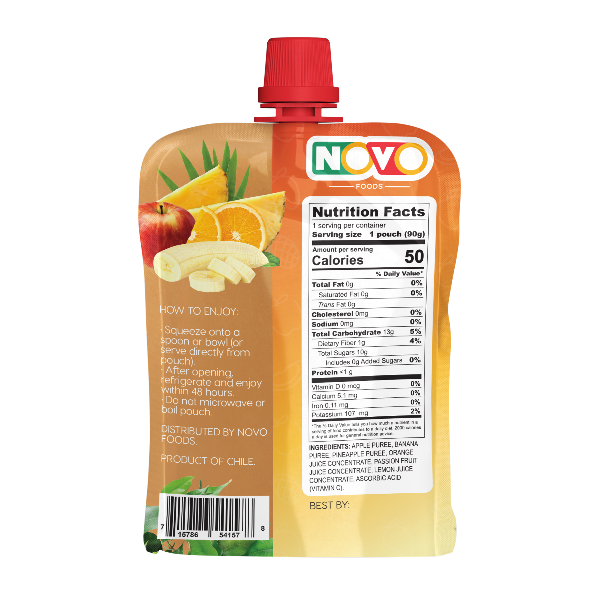
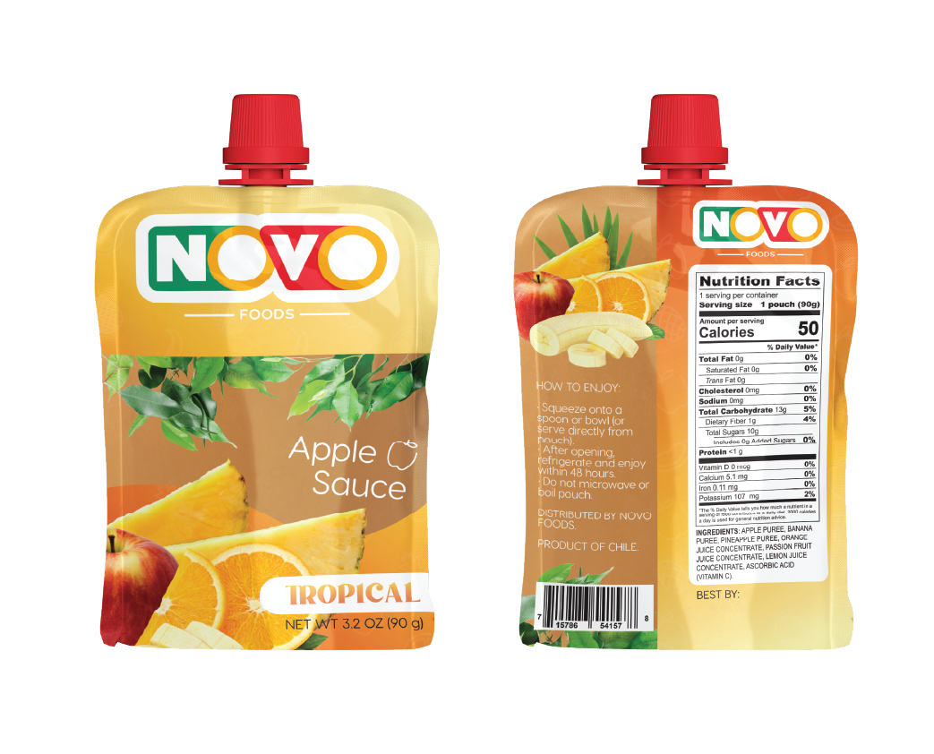
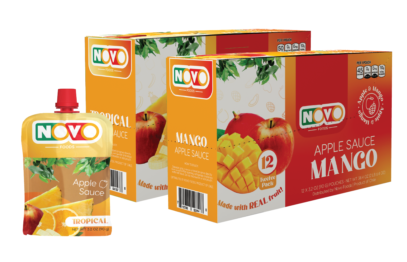
The assignment involved the visual development of two SKUs—Mango Applesauce and Tropical Applesauce—packaged in 3.2oz on-the-go pouches. The designs were optimized for brand clarity, visual consistency, and strong shelf appeal in a competitive retail environment.
Project scope included:
- Designing pouch artwork for two SKUs: Mango Applesauce and Tropical Applesauce
- Creating two display boxes to house and promote the pouches on-shelf
- Incorporating on-brand elements, flavor-specific visual themes, ingredient panels, and clear product windows
Structuring layouts to fit provided dielines and preparing press-ready files for production
Credits
The NOVO logo was a pre-existing provided asset to be incorperated in my design. The packaging dielines were also provided to me.
Foundation
Methodology
Insights gathered through:
- Client collaboration
- Market research
- Parent interviews
- A/B preference testing
SUMMARY
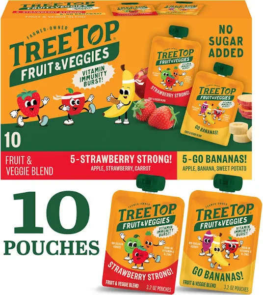
Reference materials from the client helped guide layout expectations, stylistic direction, and flavor differentiation. I also reviewed competitive examples within the children’s fruit purée category to ensure the designs aligned with market norms while introducing a fresh, brand-forward presence on shelf.
INSIGHTS
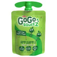
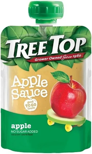
Reference materials from the client helped guide layout expectations, stylistic direction, and flavor differentiation. I also reviewed competitive examples within the children’s fruit purée category to ensure the designs aligned with market norms while introducing a fresh, brand-forward presence on shelf.
Assets
Reflection
Challenges
Key iterations included adjustments to label hierarchy and brand positioning, along with panel revisions to clarify regulatory details, update UPCs, and incorporate new nutritional charts—all completed under a compressed timeline. These revisions required precise consistency across dielines and formats, strengthening my proficiency in FDA-compliant, multi-SKU system design.
Results
The final packaging system was approved for production. This project strengthened my experience in SKU-specific label architecture, stakeholder collaboration, and cross-format design systems—reinforcing my ability to deliver cohesive, press-ready assets across multiple packaging components.
My Reflection
This project was a formative opportunity to develop a multi-SKU packaging system where visual hierarchy, flavor differentiation, and regulatory requirements culminated in press-ready, retail-bound deliverables. It deepened my technical fluency in layout adaptation and reinforced the value of thorough market research when appealing to a dual audience of children and parents within the CPG space.
Want to see more?